February 11, 2016
In the year 1997, there were around 1 million websites over the internet and after 10 years, the count reached 150 million. Similarly, there were around 1 million mobile websites in the year 2007, and after 10 years that count will definitely cross 150 million. It clearly indicates that the popularity of mobile friendly websites is growing exponentially and it will continue to grow in future years.
Initially, people were using the internet on their PCs and now quickly sliding towards the mobile phones as over 3 billion smartphones are being used worldwide. Soon, the time will arrive when most of the people will use the internet on their smartphones. With the emerging changes, the website owners are not left with any options, but to be adaptable.
Today, if a user seeks for any information then he/she search for the fastest way to get that. So, he takes out his smartphone and search for the information on the same. Although, Google also rolled out some modifications to its ranking algorithm, which treats mobile-friendliness as a factor. That means, the companies, who have not adapted this advancement of technology will miss the opportunity of increasing traffic for sure.
According to the latest research, almost 29% of companies do not have mobile-friendly websites, which signifies a big disappointment in the e-commerce world.
Mobile-Friendly Websites Always Matters for a Business
According to a recent study, more than half of digital traffic is arriving through the mobile devices, which signifies that mobile-friendly websites always matters for a business. Although, Google has also marked mobile-friendly websites as a ranking factor.
Some of the companies are still not having mobile-friendly websites, the reasons can be the lack of resources or they don’t understand its value. Around 25 to 60 percent of traffic is arriving from mobile devices, and we should appreciate the guts of these companies as they do not value their 25%-60% customers.

Why should we have a mobile-friendly website?
Leap in Smart Phones Users
Over the past few years, smartphones have become affordable for people. Not only in the US but globally, almost everyone is using the one. These mobile devices are considered as an excellent way to browse the internet. Since, it makes sense to have a mobile-friendly website, as their smartphones users are increasing rapidly.
Not-so-expensive Character
Using internet on mobile devices, is not only fast way but also inexpensive. In addition, it does not consume much time to access a website on mobiles.
Improvised User Experience
Previously, with desktop websites, it is not possible to have better user experience with low bandwidth and server speeds, but with mobile-friendly websites it is now possible. Using the mobile version of a website would lead to an enriching experience for a user, as it consumes low bandwidth and less speed.
Better SEO Structure
Mobile-friendly websites also contribute in improving the SEO structure. The search engines treat this aspect as one the ranking factors.

Key Considerations for a Mobile Site Design
· Use HTML5 instead of Flash for special effects
· Using pop-ups can lead to confusion and results in increased bounce rates
· Use appropriate size of buttons to avoid accidental clicks
Best Mobile Configurations
The mobile version configurations completely depends on a number of aspects including content on the website, available resources, budget, technological capabilities targeted audience and many more. But, below we have outlined some standard configurations for mobile sites:
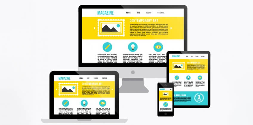
Responsive Designs
Web sites, comprising responsive designs accesses the CSS3 queries to represent the same content in two different formations – mobile and desktop. A responsively designed website automatically adapts the size of any screen.
Dynamic Serving
If your company does not have the resources to redesign mobile sites and you want to show different content to mobile and desktop visitors, then there is only one solution – to show the different HTML and CSS on the basis of what device is the visitor is using. Representing different content based on the user device is known as dynamic serving.
Different URLs
With this configuration, the visitors on smartphones will be directed on a different URL (For example, the URL will be as http://m.yourdomain.com), which is optimized with separate code and content.
Make sure that your company having a successful SEO structure with the mobile friendly website, as in coming years the mobile versions will be a boom for internet users.
If you are willing to get more information about mobile-friendly websites, then do not wait for anyone. Just type SEO Company with your city name on Google, and you will come across with numerous companies. For example, type Phoenix SEO Company if you are residing in Phoenix, or type Orlando SEO Company if you living in Orlando.
Recent Posts


ARE YOU A LEADING SEO SERVICE PROVIDER?
Get listed in world's largest SEO directory today!
Directory listing counter is continuously increasing, be a part of it to gain the advantages, 10385 Companies are already listed.