September 13, 2017
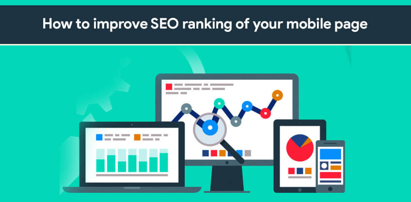
Since Google is about to roll out the mobile-first index, it has become imperative for the webmasters to design mobile-versions of their web pages. Recent surveys suggest that if a page is easily accessible through mobile phones, it is likely to be visited more. People have become habitual of browsing on their smartphones. In this scenario, it is only astute to revamp your SEO strategy. Although the mobile-first index does not seem to appear on the scene before 2018, it makes sense to think ahead. Here are some ways in which you can make your web page mobile-friendly.
1. The interface
First thing you need to look at,is the interface. If it is not mobile-friendly, it will be quite tedious for the user to navigate through your web page. This will result in less average time spent by a user on your page. Because of this reason, Mobilegeddon and its updates, discourage web pages that are not mobile friendly. Therefore, not having a mobile version for your page harms both the on-page and off-page SEO factors.

Take a look at what you can do to make the mobile interface of your page more user-friendly.
Responsive Web Design (RWD)- Responsive web design is the type of web layout that changes according to the screen size of the visitor. The benefit of this approach is that you do not have to form different websites for different devices. Google does not favor those web pages that pages that have different sites for mobile and desktop.
Progressive Enhancement- Stick to the principles of progressive enhancement. Start with the basic content and make it accessible to the various web browsers. Make sure there are no discrepancies when the web page is viewed through the mobile browser. Progressive enhancement makes it easier for the crawler bots to index the web page.
Unobtrusive Javascript- Unobtrusive Javascript separates behaviour from markup. It improves the behaviour of the page and enhances the user experience. Html is ideal for the content of the page and unobtrusive javascript is the right choice for good interface.
Viewport meta tag- This viewport meta tag allows the page to scale according to the device being used to access it. It has become an essential part of any web page layout, since mobiles are becoming the primary browsing devices.
Scroll experience- The page attracts visitors if it is easily navigable. Accessibility and the scroll experience account for most of that experience. For example, if the buttons are not of the right size it becomes hard to click on them on a smartphone. Similarly, if the users have to constantly pinch and zoom, they may not find the web page very appealing.
2. The display
The display comes next. The majority of users leave a website if the landing page is not engaging. In order to make the landing page engaging from the mobile point of view, you can take the following points into consideration.
Font Size and Images- Use a font size of minimum 12px. The image that you use must be of high resolution. High resolution images improve the user experience greatly. High quality display keeps the users engaged and increases the time spent by them on the page.
Avoid excessive content- The landing page can confuse users, if it looks too busy due to too much content stuffed in one place. Mobile browsers have limited screen space so it makes sense to keep the landing page precise and tidy.
Limited number of ads- The landing page fares better with the search engines if it can accommodate a decent number of ads but not too many. Too many ads can be annoying for the visitors and take the traffic away. You need to find an optimum balance. It is important in case of mobile browsers, as the screen space is smaller.

3. Google AMP
Make use of the Accelerated Mobile Pages initiative by Google. It is a platform that lets you build flexible pages that load quicker across all types of devices. Since it is a Google-backed project, it is likely that the pages that are designed using it will be favored by the search engine’s algorithms.

4. Avoid smartphone crawling errors
Smartphone crawling is going to get greater importance once mobile-first indexing comes into play. Smartphone crawler bots usually come across errors due to discrepancies in the desktop and mobile version. Common errors include wrong redirects, 401 error and http coding error. Other than that, often mobile pages are not accessible to crawler bots. Make sure the URL of your page does not block crawler bots by editing the robot.txt of the page.

These are the main things you can keep in mind to ensure your page does not fall in the SEO rankings due to the the new algorithms that favor mobile versions of pages over desktop ones.
Some sensible measures, with respect to the changing scenario,can help increase the SEO ranking.
More Info: 10seos
Recent Posts


ARE YOU A LEADING SEO SERVICE PROVIDER?
Get listed in world's largest SEO directory today!
Directory listing counter is continuously increasing, be a part of it to gain the advantages, 9160 Companies are already listed.