November 27, 2017

Since Google first moved to the “mobile-first indexing system”, the need for developing and developing mobile-friendly websites has received much attention. But this move alone was not the sole reason why mobile-friendly SEO techniques came into existence. According to Statista, the fourth quarter of 2018 witnessed that 47% of web traffic came from mobile devices. This is a 16% rise from the 1st quarter of the year 2015.
In 2017 alone, 63% of 2 trillion web visits in America came from mobile phones, as compared to only 37% from desktop devices, according to Stone Temple.
The data has spoken. So no further proof should be needed for your webmaster self to understand the importance of Mobile website optimization if you don’t wish to sit dud and lose your audience to your competition. And now to help this very cause of yours, here are 5 tips that will help you please your mobile users.
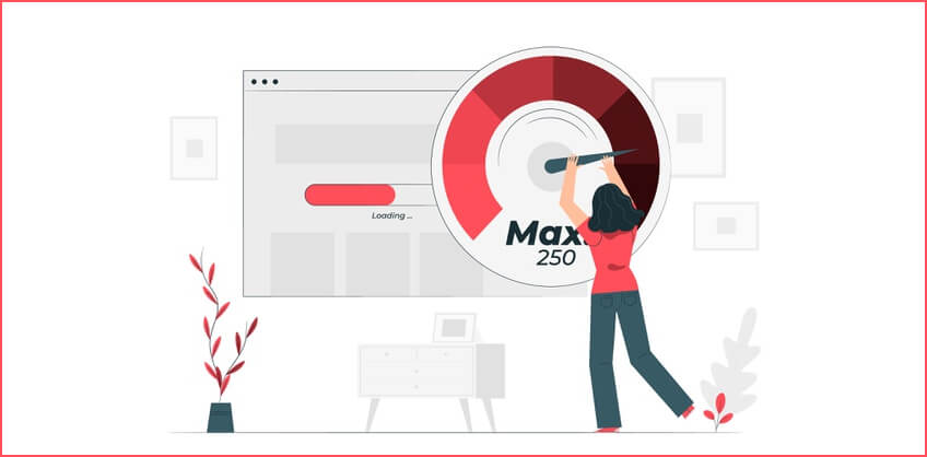
Reduce Page Load Time
People now are spending big over smartphones to get more RAM and fast processors. This is all because they don’t wish to sit idle due to the slow speed of their devices. And with such expectations and expenses, they also want you, the webmaster, to serve them with pages that open with lightning fast speed. According to a study, 53% of users abandon a website if it takes more than 3 seconds to load.
Here are some tips to help you make your page load faster:
- Minimize codes of your CSS, JScript, and HTML
- Minimize redirects
- Use browser caching
- Use CDN (a network of a geographically distributed proxy server to promote high-quality content distribution)
- Use image optimization tools to compress and scale-up your images without making them loose on their quality
2. Design for Mobile Version
Designing your website for the mobile version is an art in itself. Because though some mobile phones are faster than many desktops, the screen size is still a constraint. So have these points in mind while designing for your mobile device audience:
A. Do not use flash
This is because not everyone who uses a smartphone bothers to install the required plugins for running flash videos.
B. Think “Finger”
As a majority of people navigate using fingers and not sticks, it becomes annoying if tabs and texts on your mobile version are not spaced right. This could lead to them clicking the wrong buttons.
C. Don’t use too many Pop-ups
It only makes sense if you want to convert your visitor into your lead. But unlike desktops, a random pop-up display is not well received by mobile users. They might upset your users a bit, leading to an increased bounce rate.
3. Keep the Content “To-the-Point”
People nowadays are known to be less patient. And the ease of accessing the web from anywhere with their mobile phones, added with the small screen, only adds fuel to the fire. Small screens, fingers as a scrolling device, unwillingness to work on multiple tabs, and sometimes slow connectivity make mobile reading a challenge.
Try following these tips while writing or developing content for your mobile website:
- Keep it short
- Add visuals (Like Infographics, charts, videos, gifs.
- Use hard-hitting titles
- Use short paragraphs
- Write short sentences
4. Think Local Optimisation
According to Nectafy, a growth content company, “ 88% of consumer local business searches on a mobile device either call or visit the business within 24 hours”
Seoexpertbrad.com notes that the intention behind 46% of Google search is to seek local information.
And HubSpot reports that 97% searched online to find a local business.

So don’t forget to optimize your website for your local business. This includes:
- Creating a Google My Business Account
- Using the name of your city and state in your title and posts
- Optimize your URLs by putting the same name into it too
- Use the name of your locality and city as your alt tag
- Getting your business reviewed by users
- Optimize your meta description with city and state names as your keywords.
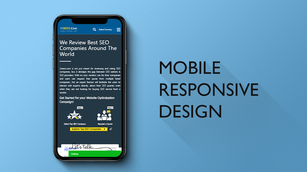
5. Choose between Dynamic, Responsive, and Separate sites
Google doesn’t differentiate among these three options, but you sure can. So let us have a look at three of them individually, so you could decide which one is the right option for you.
A. Responsive Website
A responsive web site is one that adapts itself according to the screen resolution of users. In other words, it can stretch, shrink, and expand according to a users device. A responsive website could perform the following function:
- Add or remove content to fit different screen sizes
- Moving a section of content to a new area of a web page
- Putting in or pulling out options from the navigation menu
- Serving different images for different versions of devices

Responsive designing is done by writing separate web codes for different screen sizes. There are some cons too when using this aspect of web designing, like:
- As all the versions are tied to one website, all of them would go down together in case of server error.
- Styling for mobile devices could take time as responsive design is CSS based.
B. Dynamic Serving
Dynamic serving means serving different site structure depending upon the device that searches for your website, but with the same URL link. The main difference between dynamic serving and responsive design is that the former takes building a separate website for each device by changing the HTML structure.
But the benefit is that visitors don’t need to remember separate links as all the HTML codes are linked with one URL only.
Dynamic serving is made possible by varied HTTP headers. Which means that the ISPs, depending upon the cached version of your website, help you in serving the different versions to different devices.
C. Separate Websites (Parallel Links)
Separate sites, or parallel URLs, means having two versions of the same website run on two different URLs. One for desktop and one for mobile devices. To see an example of this, you can log on to your facebook account by using both desktop and your mobile.
When you have done that, you will see that an “m” appears at the beginning of the Facebook domain name on the mobile version. Something like “m.facebook.com”. This means that servers have detected you are using a mobile device, and have redirected you to the mobile version of Facebook. The same letter is not there when accessing the same website from your desktop. The major advantage of using an “m.domain.com” format is that if your desktop version suffers a breakdown, users can still access the mobile version of your website.
But sometimes, servers could lend your users to the wrong version, so make sure you include the option of taking them back to their desired website format.
Recent Posts


ARE YOU A LEADING SEO SERVICE PROVIDER?
Get listed in world's largest SEO directory today!
Directory listing counter is continuously increasing, be a part of it to gain the advantages, 9169 Companies are already listed.